After looking at Pat’s project I got very interested in the process of producing these types of images so I decided I would do a couple posts as I work through a image I was asked to do for work. Everyone has a different process and I thought it might be interesting to get a discussion going on the subject. Currently, I am building surfaces and applying and testing materials and have chosen very little for specifics except for what I plan to model.
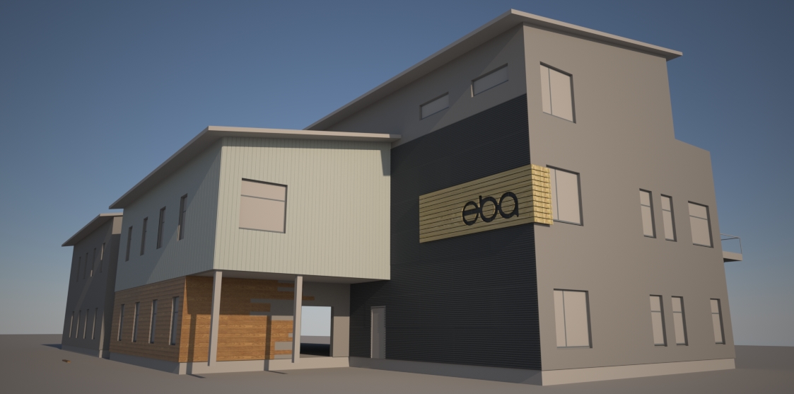
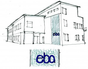
The sign I designed on the side of the building with ‘eba’ was what started this process for me as my boss really liked it and thought that it helped with some of the client’s desires for the building’s image and also to break up the large blank wall that it sits on. The sign is also my favorite part so far but she would like some more development on it. Part of the goal of these images will be to convince the client not to make their siding be some variation of their corporate blue and for this reason my boss asked me to include this blue in the sign somehow. Any thoughts?
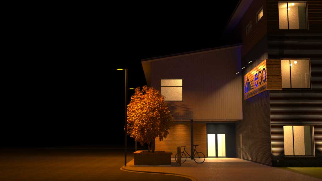
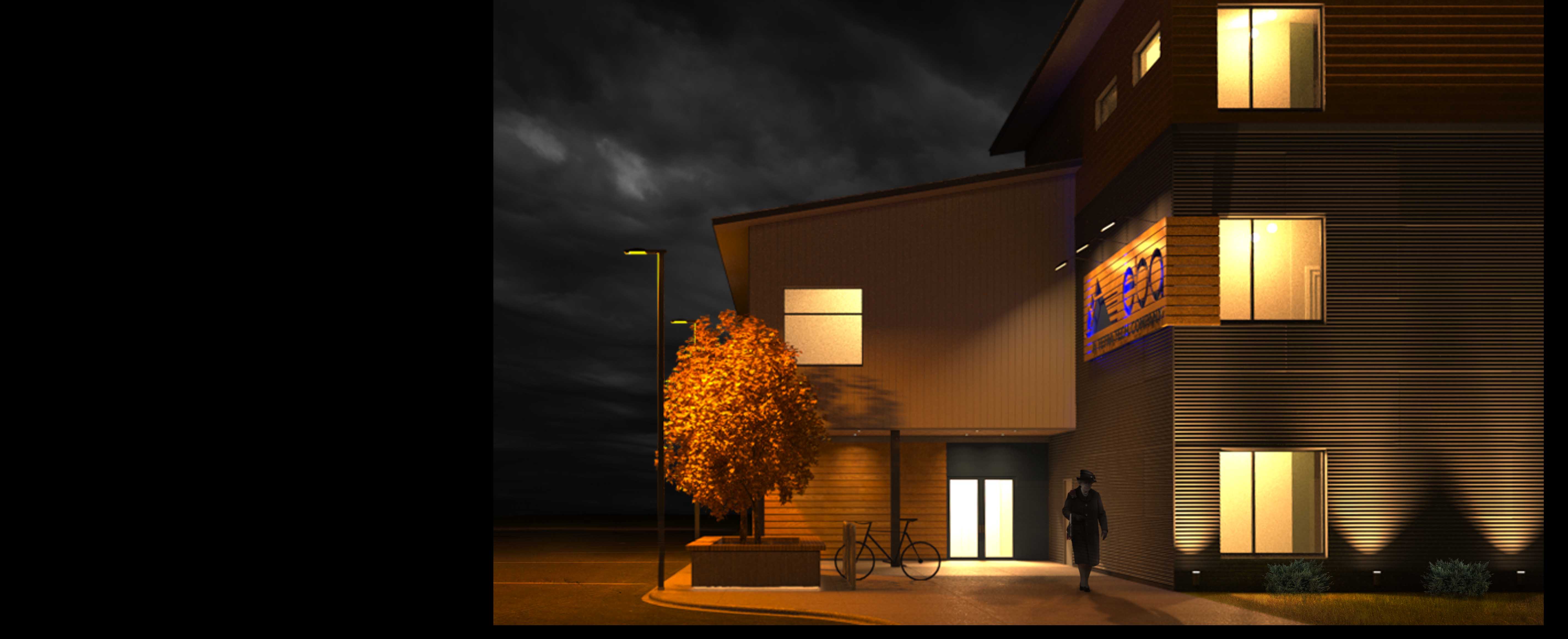
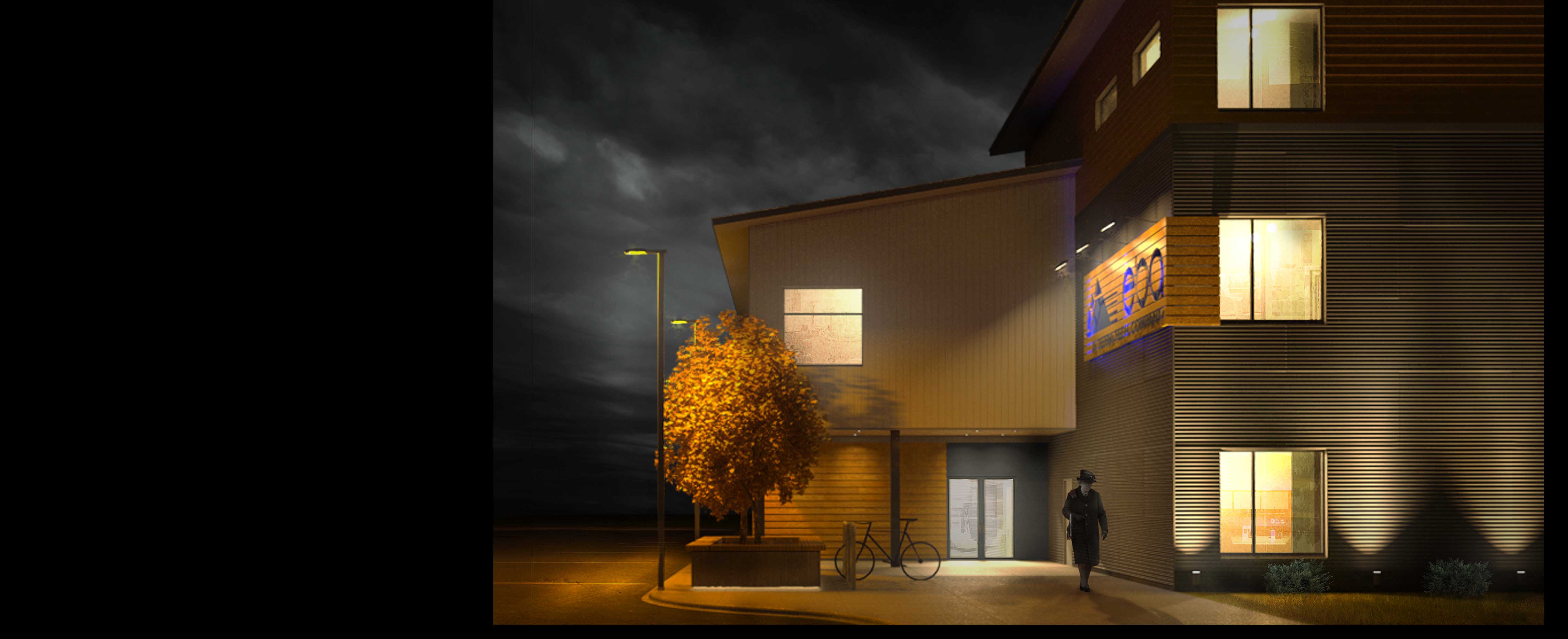
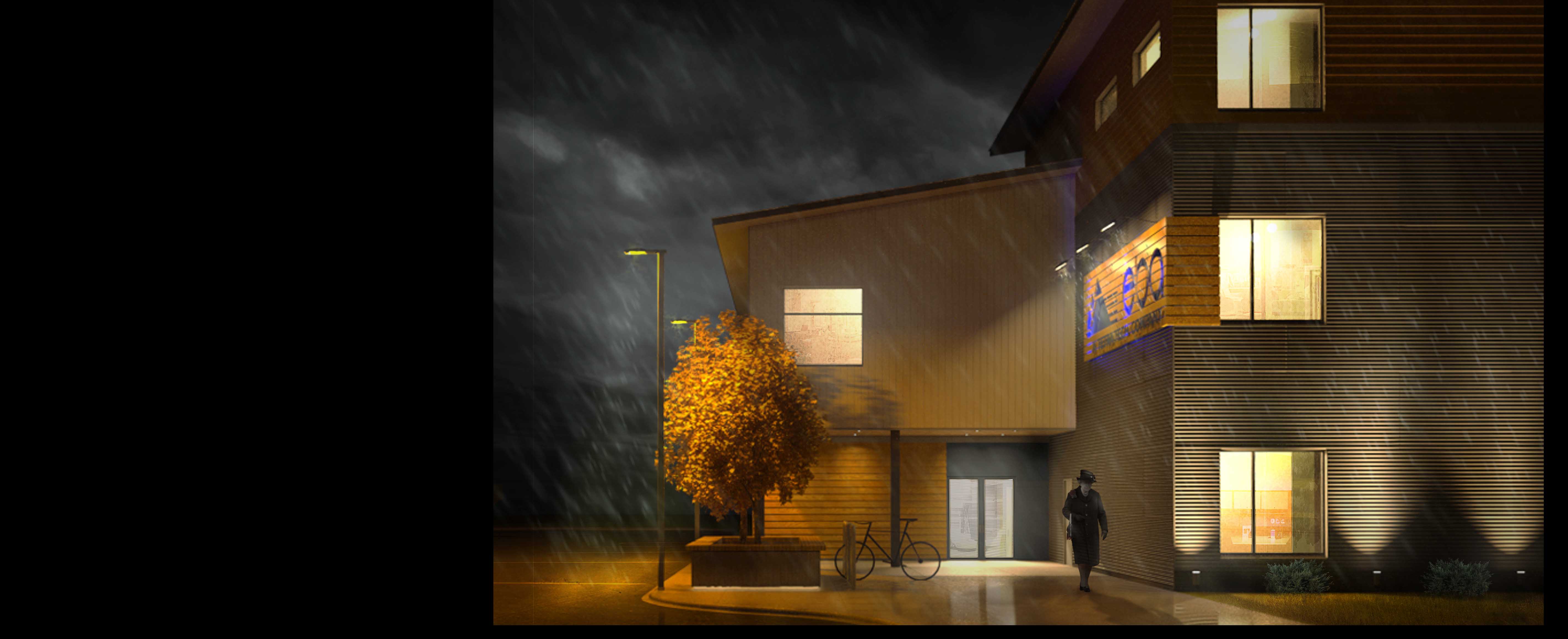
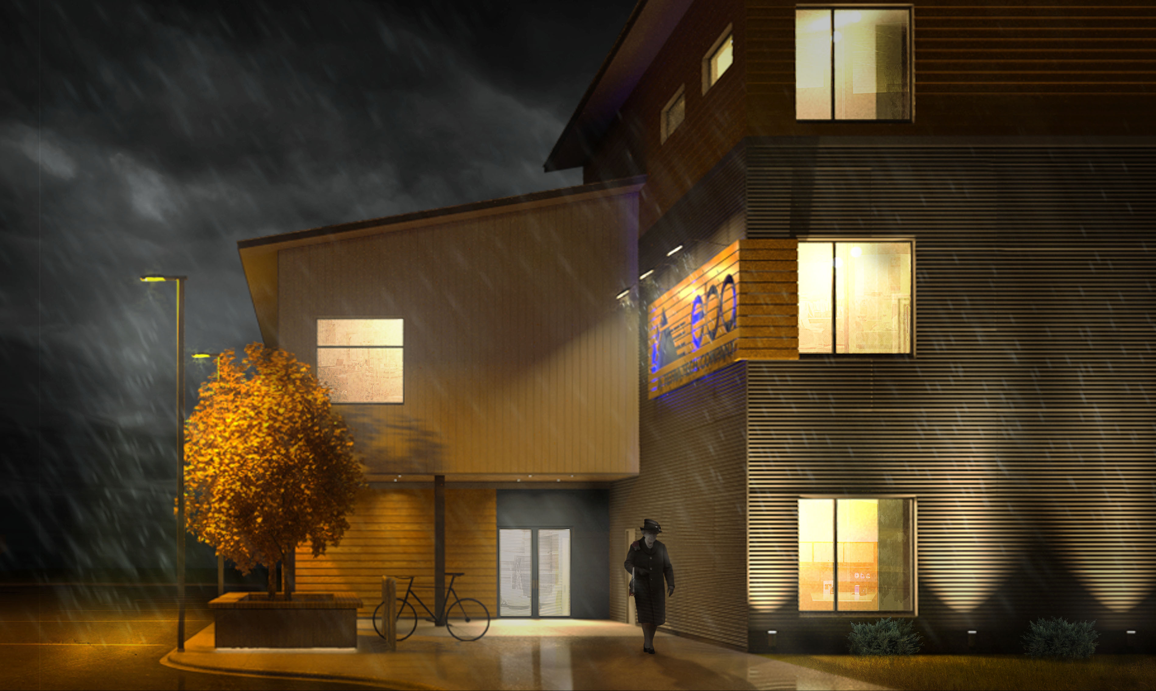
I finished the above image and was pretty happy with it but I forgot the file on my work computer so maybe I’ll post it later. I was asked to do another image and became interested in a tutorial Logan had posted, http://youtu.be/bA0YvxBPdYo and at first was just watching it but eventually ended up doing almost every step. I learned a lot about photoshop and had a lot of fun with this image. I was pretty happy with the model/rendering to begin with but I think this technique really helps to add a certain mood to the scene.
Steve,
I added this image,
This is a difficult design problem.
I really like what you have up there, I think its a nice way to break up the large empty wall, and provide a nice opportunity for signage. The only thing i could think of as far as minimizing that wall, and having the sign in the corporate color, is to maybe have a vegetated wall with the blue letters pinned about a few inches (cm? eh?) off of it.
But I am not sure of the climate, or if that even feasible.
I like your signage a lot! I think it makes the building work. One idea that comes to mind is that that whole signage piece you have is attached to the building, but set off by a few inches, lights could be installed behind the sign out of sight, and at night it could be lit up. The lights could possibly even be blue, it would sort of work like an under body light kit on a car. Light would reflect off the building and the sign would block the light letting you make out the eba at night.
Snow/Rain image looks amazing. I hope your boss liked it because it is fantastic! I couldn’t tell that this post had been updated that is why I was slow to comment. I really need to run through that tutorial my self, this just looks really great!